Hope you all are having a wonderful week so far! Today marks the Design a Book Cover Contest, hosted by Teralyn Rose Pilgram over at A Writer’s Journey. Check out the other entries below, and vote on your favorites!&
Below, you can see my entry:
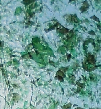
What do you guys think? :) The background of the book cover is part of a photo that I took of a stained glass window in one of the chapels back home. I think there are many different ways you can interpret what you see on cover…whether it’s a certain shape created by the different pieces of glass or a deeper, more subtle and emotional abstraction embedded within the image itself.
Breathless is a writing project that I may be working on during National Novel Writing Month, which is honestly the most awesome and craziest writing event you could EVER have the insanity to participate in (if you didn’t already dive in last year and figure that out yourself)
I really, really loved working on my entry for the contest solely because it gave me even more inspiration to continue the project (I will stay very ambiguous about “the project” because no writer is supposed to actually talk about what they are working on, right? Therefore, I am going to keep this in “hush-hush mode”) and sparked that kind of initial fiery interest and passion I had felt when I first started it.
Creating the book cover also made me realize that I REALLY enjoy the art of making book covers….thinking about what colors and images to use, how to arrange the text, and–most importantly–pondering over what a book cover should (and shouldn’t) reveal and depict about the story inside.
I think I found my new procrastination hobby. ;)


I like the image very much, but your title and name need to stand out more.
It looks like a beautiful piece of glass! :) Nice cover.
I agree with Scherazade, very interesting cover, but perhaps if the title and name were a bit larger and in a darker green rather than white?
Anyway I like it a lot, am a fellow contestant doing the rounds of the entries and totally in awe! (And you’re so right about cover artistry being a good ‘procrastination hobby’. I can never understand why we writers, who are so fervent and passionate about our craft, are always looking for an excuse to procrastinate!)
I love the image. I agree it is a little hard to read the title–but I like that you used your own image instead of finding others off the web (like I did).
Gah! This cover is beautiful! I could see it on the shelves at Barnes and Noble. Seriously. Its gorgeous!
P.s. I love photograph too!
Oh yeah, I’m with you on the diversionary hobby. I find that I enjoy making book covers and I have a fair amount of covers that I’ve done nothing with as yet. I think it’s a lot of fun, though it can be a tad bit frustrating when you don’t have just the right image to work with.
I also think the title and name would have a bigger impact if they were a bit more prominent. Maybe a deeper colour on the font? Stained glass? I’m loving what you’ve done with it.
It’s awesome that you used your own photo, and you’re right, it’s open to interpretation. I thought it looked like crushed/cracked ice. Nice job!
i’m a bit of a topshop addict (eeek!)
its such a good shop :)
thanks for the comment on my blog :)
XOXO, BECCA
http://www.fashion-train.co.uk
I know the feeling. I have just made a similar discovery about cover making myself. :)
Stained glass from chappel?? Cool taste!!
thanks for visiting my blog!!
with warm regards
Another Author
that cover art is really neat. good luck! xx opinionslave
/ twitter: @opinionslave
What a cool picture! I thought it was paper art, so I found it extra intriguing that it was part of a stained glass window. I agree with the others on the title/author name, but otherwise, I think it would make a GREAT cover.
And I liked the “procrastination hobby”. We all need more of those, right? :D
Good luck with NaNo!
Thank you everybody for all of your suggestions and compliments. They are much appreciated.
Hywela you definitely hit the nail on that dilemma, as it stumps me too–writers (and artists of other forms like musicians and painters and cooks) get so inspired by what
we do, and yet we try and do anything we can to delay our next session.
Perhaps when I go back and alter the cover for my own use, I will try and see if I can bold the title/name more so that it stands out like it should.
~TRA